Munchie Planet
Illustration, Branding, Typography, Layout
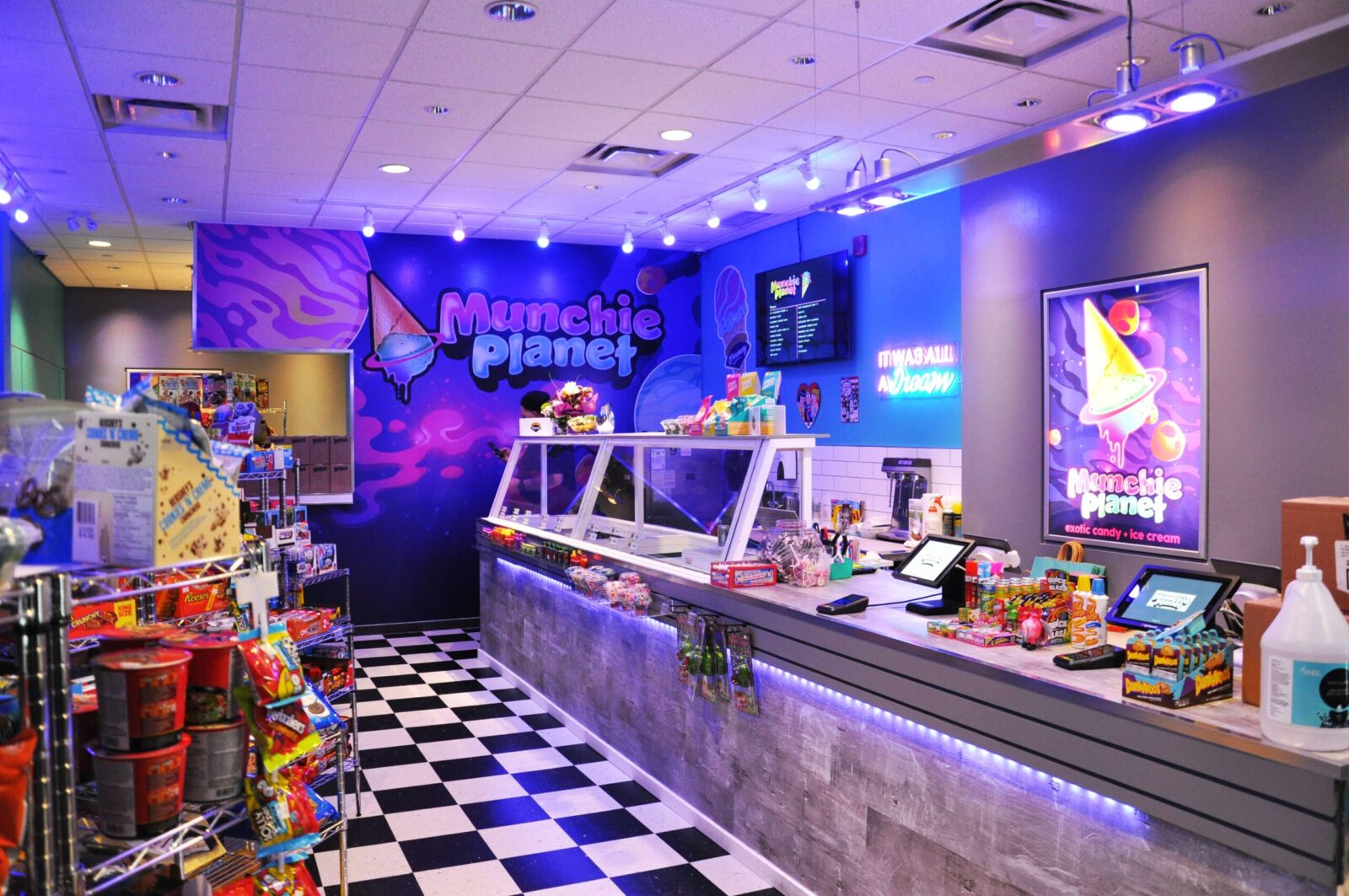
During my time as a Junior Designer at Identity Graphics Services in Duncan, BC, I had the task of crafting a logo for Munchie Planet, a candy shop boasting limited and exotic treats. This challenge placed me in the roles of illustrator, typographer, and layout designer, as I collaborated closely with the Creative Director at IGS.
Armed with Illustrator and Procreate, I embarked on a creative journey to visually capture the essence of Munchie Planet. The goal was to encapsulate the shop's unique character and offerings within a distinctive and memorable logo.
The collaborative efforts between myself and the Creative Director ensured a harmonious blend of skills and perspectives, resulting in a logo that not only met but exceeded the expectations of our client, Munchie Planet.


